Everything needed to produce something that looks like Proof IT — the mark, the palette, the type, the spacing, the components and the way we write. Built from the live design system behind this site, so what you see here is what actually ships.
Proof IT is a European software engineering company, founded in Riga in 2004. We build a full-cycle core insurance platform (PINS), a family of named AI products, and custom software for regulated industries. ISO 27001 and ISO 9001 certified.
Proof IT — two words, capital I and T — in all running text, legal documents and press. PROOFIT set solid is the logo only, never body copy. Legal entity: Proof IT SIA. Do not write “ProofIT”, “Proof-IT” or “proofit” outside of URLs and email addresses.
Simplifying the future through code. Used in the hero, the logo lockup and presentation title slides. Sentence case, full stop only when it ends a sentence. Never translated in marketing assets.
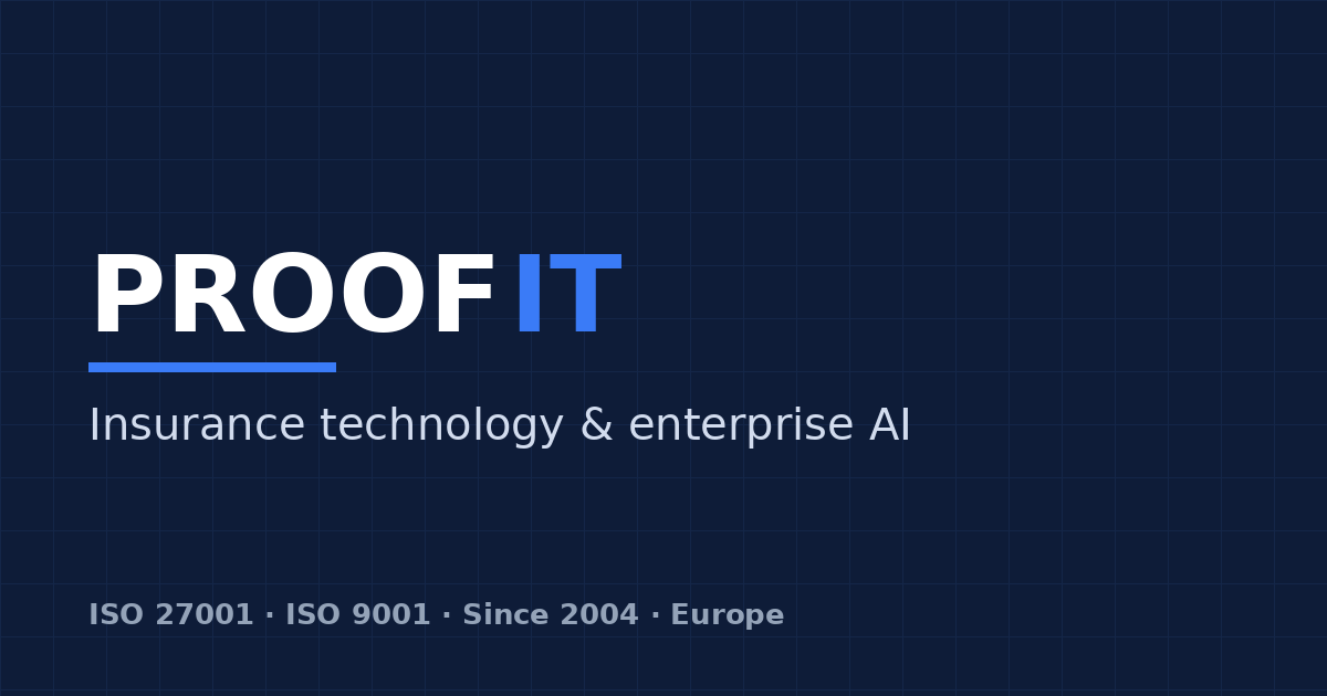
Insurance technology & enterprise AI. The one-line descriptor for social images, banners and stands, where the tagline is too abstract to explain the business.
Proof IT is a European software engineering company building core insurance platforms, enterprise AI products and custom software for regulated industries.
Founded in Riga in 2004, Proof IT is a European software engineering company of around 100 engineers. It delivers PINS — a full-cycle core insurance platform — a family of named AI products for voice, documents and customer operations, and custom engineering for regulated industries. Proof IT is certified to ISO/IEC 27001 and ISO 9001 and holds a Latvian Industrial Security Certificate.
Everything we sell falls under one of three directions. Each one owns an accent colour, and that colour is the only signal of direction anywhere in the brand — in cards, charts, slides and diagrams.
PINS core platform, broker and fleet portals, TPA control layer, claims automation. Accent: brand blue.
SARA, MailFlow, VoiceConnect, CommsHub, Ingredivo, MCP server, agent layer. Accent: signal green.
Legacy modernisation, bespoke platforms, integration work for regulated industries. Accent: violet.
The mark is a wordmark: PROOF in the text colour, IT in brand blue, and a blue rule under the first 56 % of the word. The rule is the signature — it is what makes the icon, the avatar and the wordmark read as the same brand. Inter Black, tracking −0.04em.
The icon is a crop of the wordmark, not a separate logo: the P from the same Inter Black setting, on brand navy, with the same blue rule underneath. Use it for favicons, app icons, social avatars and anywhere below the wordmark’s minimum width.
Keep free space on all four sides equal to the cap height of the P. Nothing enters it — no text, no rules, no photo edges, no partner logos.
| Use | Minimum |
|---|---|
| Wordmark on screen | 96 px wide |
| Wordmark in print | 18 mm wide |
| Icon on screen | 16 px (favicon) |
| Icon in print | 8 mm |
Below 96 px the rule and the tracking stop reading correctly — switch to the icon instead of shrinking the wordmark further.
The palette is almost entirely neutral. Colour carries meaning: blue is insurance, green is AI, violet is custom engineering. If something on a page is coloured, it is because it belongs to one of those three — never for decoration. Click any swatch to copy its hex.
| Token | Dark theme | Light theme | Used for |
|---|---|---|---|
--bg | #0A0B0D | #FAFAFB | Page background |
--bg-elev | #131418 | #FFFFFF | Footer, raised panels |
--bg-card | #16181D | #FFFFFF | Cards, tiles |
--bg-card-hover | #1C1F25 | #F5F6F8 | Card hover state |
--border | #25272D | #E6E7EB | Default 1 px hairline |
--border-strong | #34373F | #D3D5DB | Hover, ghost buttons, dividers |
--text | #ECECEF | #0A0B0D | Headlines, primary copy |
--text-dim | #9CA0AA | #4D5159 | Body copy, descriptions |
--text-muted | #6B6F78 | #7A7E87 | Labels, captions, eyebrows |
Headlines, body, UI, print. Weights 400 / 500 / 600 / 700 for text,
900 reserved for the logo. Headlines are set at weight 500 with negative tracking — the
restraint is deliberate; we do not shout in bold.
Free, open-source (SIL Open Font License). Office fallback: Segoe UI, then Arial.
Eyebrows, labels, table headers, contacts, version stamps, code and
anything that should read as machine output. Weights 400 / 500 only, uppercase, tracking
+0.15em at label sizes.
Free, open-source (SIL Open Font License). Fallback: any system monospace.
Max width 1280 px, centred, side padding 32 px — 20 px below 768 px.
Vertical padding 60 px (44 px for tight sections), separated by a single 1 px border, never by a background change.
Cards sit on a 12–16 px gap grid: three columns on desktop, two on tablet, one below 640 px.
One shadow only, and only on genuinely floating elements (modals, hovering feature
cards):
dark — 0 20px 60px rgba(0,0,0,.4)
light — 0 12px 40px rgba(15,18,25,.06)
Everything else separates with a 1 px border. Flat is the default.
A fixed 64 × 64 px grid at 2.5 % white (dark) / 4 % black (light), plus one blurred radial glow in the AI accent behind the hero. Both are decoration — never place content that depends on them.
These are live elements from the site’s stylesheet, not screenshots. Toggle the theme in the navigation to see how each behaves.
Inverse fill, 10 px radius, 12/24 padding, 14 px medium, trailing ↗. One per view.
Transparent with a strong border. Secondary paths — documentation, comparisons.
Pill in the navigation bar. Reserved for “Contact”.
PINS core platform
Policy, claims, billing and partner portals on one data model, deployed in the customer’s cloud or ours.
MailFlow
Reads incoming mail, classifies it, extracts the data and files it where the process expects it.
Legacy modernisation
Strangler-pattern replacement of core systems that cannot go offline.
Every section opens the same way: a mono eyebrow with a number and a short label, then one headline of no more than about 22 characters per line.
Information security management — certified.
Quality management — certified.
Certificate of the Republic of Latvia.
We sell engineering, so we show engineering: architecture diagrams, product interfaces, real people. Stock imagery of handshakes, glowing brains, robots and blue circuit boards is off-brand and never appears in our materials.
1200 × 630 px, brand navy field with the 64 px grid, wordmark at the left, descriptor beneath, credential line at the bottom. One per major page.
1 px borders, 14 px radii, mono labels, direction accents for flows. Same palette as the interface — a diagram should look like it was cut out of the product.
Line icons on a 24 px grid, 1.5 px stroke, round caps, no fills. Text-dim by default, direction accent when the icon carries meaning.
People at work in natural light, no heavy grading. Faces stay recognisable; office shots stay unstaged.
Real product, anonymised data, cropped to what the sentence claims. 14 px radius and a 1 px border, never a browser chrome mockup.
Supplied by the funding programme and never restyled, recoloured or cropped. They keep their own clear space in the footer strip.
Our readers are insurers, TPAs, brokers and IT leads in regulated industries. They are sceptical by profession. We write for someone who will check the claim — short sentences, concrete numbers, no adjectives doing the work of evidence.
| Written as | What it is | Note |
|---|---|---|
| PINS | Core insurance platform | All caps, never “Pins” |
| SARA | AI assistant | All caps |
| MailFlow | Document and mail AI | CamelCase, one word |
| VoiceConnect | Voice AI | CamelCase, one word |
| CommsHub | Communications hub | CamelCase, one word |
| ClaimMail | Claims correspondence AI | CamelCase, one word |
| Ingredivo | Product-data AI | Title case |
Product names never take the company name as a prefix in body copy — write “PINS”, not “Proof IT PINS”, once the company has been introduced.
Vector master files. Use them as supplied. If a format you need is missing, ask proofit@proofit.digital rather than rebuilding the mark yourself.
A brand book that hides its loose ends stops being useful. These are the decisions and files still outstanding as of v1.0.